
Hello, world: the making of this blog
It is customary that a new blog is started with a hello world post, and so in this first blog entry we will go over how this blog came to be.
The curse of choice
The blogging world does not suffer from a lack of choice, which makes it a daunting task to pick one solution to rule them all. So, how does one create a blog in the year 2024?
Probably the easiest way to get started is to use a blogging platform: some of the popular choices are Blogger, WordPress, Medium, as well as newer entrants into the scene Bear and Ghost. The benefit of this approach is that all you really need to think about is your content - everything else is handled for you. The downside is, then, that you are stuck with the tools your platform provides. Still, this is probably the right choice for the vast majority of people, as these platforms are generally pretty good.
As an engineer, however, I find the notion of having to just use someone else’s tools too limiting. What if I want to include an interactive demo component in my blog post? What if I want to migrate to another hosting solution? What if I want to Rickroll the reader when they scroll past an interactive element without trying it out? Enter self-hosting.
Self-hosting blogs does not have to be complicated, unless of course you really want to make it. At its simplest (and most time-consuming), one can write HTML code by hand and publish it on any hosting provider. Artisanal HTML is what they call it nowadays.

For those of us that can think of better use of their free time, there are static site generators. A static site generator is a program that generates static HTML from code, an automation tool for creating web pages. Looking at the GitHub stars, the top 5 most popular (opensource) static site generators are Next.js, Hugo, Gatsby, Nuxt and Jekyll. If I were to pick from these, I would probably go with Hugo, as I increasingly find myself suffering from React fatigue (Next and Gatsby) and have no interest learning Vue (Nuxt). Just outside the top 5, however, is my top pick and what this blog (and site) is built with: Astro.
Astro
Astro has a lot going for it: it is fast, modern, extensible and has an active community. Better yet, with Astro you can bring your own UI framework of choice, be it React, Preact, Vue, SolidJS or Svelte. Even better, you can mix and match the UI frameworks in the most perverted ways: write one component in React, another in Solid, third one in Svelte, and then combine them all in one MDX file. Speaking of MDX, Astro has an official integration for it. But what is MDX? MDX is Markdown with blackjack and hookers JSX and custom components. You write your markup (hehe get it? markUP ⬆️), add a dash of frontmatter, sprinkle some custom components and voilà, you got yourself an interactive blog post. Too rest of the owl for you?

Let’s take it step by step, then, from the very beginning.
The starting point
To save a little bit of time and effort, I decided to use the Astro Blog template.
To create a new Astro project using the Blog template, I ran pnpm create astro@latest --tepmlate blog in my terminal. Below you can see the correct answers to the installer prompts: absolutely yes to TypeScript, yes to Strict, no point not installing the deps, and might as well init a new git repo.
pnpm create astro@latest --template blog

astro   Launch sequence initiated.

 dir   Where should we create your new project?
       ./astro-blog
    ◼  tmpl Using blog as project template

  ts   Do you plan to write TypeScript?
       Yes

 use   How strict should TypeScript be?
       Strict

deps   Install dependencies?
       Yes

 git   Initialize a new git repository?
       Yes

    ✔  Project initialized!
       ■ Template copied
       ■ TypeScript customized
       ■ Dependencies installed
       ■ Git initialized

next   Liftoff confirmed. Explore your project!

       Enter your project directory using cd ./astro-blog
       Run pnpm dev to start the dev server. CTRL+C to stop.
       Add frameworks like react or tailwind using astro add.

       Stuck? Join us at https://astro.build/chat

╭─────╮  Houston:
│ ◠ ◡ ◠  Good luck out there, astronaut! 🚀
╰─────╯
At this point, the project structure looks something like this:
├── README.md
├── astro.config.mjs
├── package.json
├── pnpm-lock.yaml
├── public
│   ├── favicon.svg
├── src
│   ├── components
│   │   ├── BaseHead.astro
│   │   ├── Footer.astro
│   │   ├── FormattedDate.astro
│   │   ├── Header.astro
│   │   ├── HeaderLink.astro
│   ├── consts.ts
│   ├── content
│   │   ├── blog
│   │   └── config.ts
│   ├── env.d.ts
│   ├── layouts
│   │   └── BlogPost.astro
│   ├── pages
│   │   ├── about.astro
│   │   ├── blog
│   │   ├── index.astro
│   │   └── rss.xml.js
│   └── styles
│       └── global.css
├── tailwind.config.mjs
└── tsconfig.json
Easy, right? I was now able to start the dev server with
pnpm dev and had my new blog app running on http://localhost:4321/ in dev mode.
At this point the blog looks like this:

So, what did we get for free by using the Blog template? Thanks to MDX, I can just copy-paste the text from the template repo’s README.md:
- ✅ Minimal styling (make it your own!)
- ✅ 100/100 Lighthouse performance
- ✅ SEO-friendly with canonical URLs and OpenGraph data
- ✅ Sitemap support
- ✅ RSS Feed support
- ✅ Markdown & MDX support
It is also worth mentioning that we get syntax highlighting with Shiki for free, which is especially important for tech blogs that include code snippets.
Not bad, time to go live to let the world wide web bask in the glory of my new cookie-cutter blog with unoriginal content and maybe even misinformation but at least it’s not AI slop? Not so fast!
It’s a good starting point, but some things are not quite there. For people without visual handicaps, the most obvious one is the lack of dark mode.

Such a grave offense cannot be excused, so it needs to be addressed.
Going deeper
Before getting into the dark mode implementation, we need to address styling on a more general level. I do not particularly enjoy writing vanilla CSS and instead much prefer TailwindCSS. Astro has an integration for Tailwind, so setting it up is rather trivial. A must have for Tailwind is the prettier plugin that auto sorts the classes in a predictable way, so let’s install that too: pnpm add -D prettier prettier-plugin-tailwindcss and then create a .prettierrc file with the content
// .prettierrc
{
"plugins": ["prettier-plugin-tailwindcss"]
}
Tailwind also comes with a CSS reset, so the blog looks different without even defining any custom styles. While I was at it, I also installed daisyUI, which is a Tailwind plugin that provides a set of ready-made components.
Dark mode
Let’s add some styling for both light and dark themes to the global.css file.
/* global.css */
@tailwind base;
@tailwind components;
@tailwind utilities;

@layer base {
  :root {
    --background: 0 0% 100%;
    --foreground: 240 10% 3.9%;
  }

 .dark {
    --background: 240 10% 3.9%;
    --foreground: 0 0% 98%;
  }
}

@layer base {
  body {
    @apply bg-background text-foreground;
  }
}
My global CSS file has a whole bunch of other styling rules but for the sake of brevity those are omitted.
Onto the dark mode implementation. For this, we can create a new Astro component.
<!-- ThemeToggle.astro -->
<button class="theme-toggle" aria-label="Theme toggle">
  <svg
    xmlns="http://www.w3.org/2000/svg"
    viewBox="0 0 24 24"
    fill="currentColor"
    class="h-6 w-6 text-gray-400 dark:text-gray-200"
  >
    <path
      fill-rule="evenodd"
      d="M9.528 1.718a.75.75 0 01.162.819A8.97 8.97 0 009 6a9 9 0 009 9 8.97 8.97 0 003.463-.69.75.75 0 01.981.98 10.503 10.503 0 01-9.694 6.46c-5.799 0-10.5-4.701-10.5-10.5 0-4.368 2.667-8.112 6.46-9.694a.75.75 0 01.818.162z"
      clip-rule="evenodd"></path>
  </svg>
</button>

<script>
  document.addEventListener("astro:page-load", () => {
    // the rest
    const themeToggle = document.querySelector(
      ".theme-toggle"
    ) as HTMLButtonElement;
    themeToggle.addEventListener("click", () => {
      if (
        localStorage.theme === "dark" ||
        (!("theme" in localStorage) &&
          window.matchMedia("(prefers-color-scheme: dark)").matches)
      ) {
        document
          .querySelector("meta#theme-color")
          ?.setAttribute("content", "#f3f4f6");
        document.documentElement.classList.remove("dark");
        localStorage.theme = "light";
        themeToggle.innerHTML = `<svg
    xmlns="http://www.w3.org/2000/svg"
    viewBox="0 0 24 24"
    fill="currentColor"
    stroke="currentColor"
    class="h-6 w-6 text-gray-400 dark:text-gray-200"
  >
    <path
      stroke-linecap="round"
      stroke-linejoin="round"
      strok-width={2}
      d="M20.354 15.354A9 9 0 018.646 3.646 9.003 9.003 0 0012 21a9.003 9.003 0 008.354-5.646z"
    />
  </svg>`;
      } else {
        document
          .querySelector("meta#theme-color")
          ?.setAttribute("content", "#101828");
        document.documentElement.classList.add("dark");
        localStorage.theme = "dark";
        themeToggle.innerHTML = `<svg
  xmlns="http://www.w3.org/2000/svg"
  viewBox="0 0 24 24"
  fill="currentColor"
  stroke="currentColor"
  class="w-6 h-6 text-gray-400 dark:text-gray-200"
>
  <path
    stroke-linecap="round"
    stroke-linejoin="round"
    stroke-width={2}
    d="M12 3v1m0 16v1m9-9h-1M4 12H3m15.364 6.364l-.707-.707M6.343 6.343l-.707-.707m12.728 0l-.707.707M6.343 17.657l-.707.707M16 12a4 4 0 11-8 0 4 4 0 018 0z"
  >
</svg>
`;
      }
    });
  });
</script>
Very basic but gets the job done. Add it to the Header component and enjoy 😌
While the component kinda works, we still need to add some logic to the BaseHead component to persist the theme properly.
<!-- BaseHead.astro -->
<script>
if (
  localStorage.theme === "dark" ||
  (!("theme" in localStorage) &&
    window.matchMedia("(prefers-color-scheme: dark)").matches)
) {
  document.documentElement.classList.add("dark");
} else {
  document.documentElement.classList.remove("dark");
}
</script>
With this in place, the visitors are able to toggle dark mode on and off, and their preference is persisted through subsequent page loads.
RSS
RSS is very old tech but it’s still one of the best ways to stay up to date with your reading sources.
Lucky for us, the Blog template comes with RSS preconfigured. The way it’s configured, however, exposes all blog posts, regardless of their state. I like to be able to filter out the posts that are not ready for prime-time, so a change to the blog collection schema is needed: add an optional boolean field isPub, indicating whether the post should be publically available or not. Then in rss.xml.js file we can simply filter out WIP posts
export async function GET(context) {
  const posts = await getCollection("blog");
  return rss({
    title: SITE_TITLE,
    description: SITE_DESCRIPTION,
    site: context.site,
    items: posts
      .filter((p) => p.data.isPub)
      .map((post) => ({
        ...post.data,
        link: `/blog/${post.id}/`,
      })),
  });
}
The RSS feed with select blog posts is now exposed at
/rss.xml
View Transitions
Astro uses a Multi-Page App (MPA) approach. As a result, navigating between pages causes a visible shift. In order to smooth over the rough edges, we can use view transitions.
Enabling view transitions in Astro is as simple as adding a ClientRouter to a page or common layout component. I decided to enable view transitions for my entire site, so I added ClientRouter to the BaseHead component.
Cool! Page transitions are now animated in supported browsers. It should be mentioned that enabling view transitions also enables site-wide link prefetching. I enable link prefetch regardless but for those that want their sites to be slower, link prefetch can be disabled by setting the appropriate config option in astro.config.mjs. Another side effect of view transitions is that the ThemeToggle no longer works, stemming from the way scripts are executed. Anyway, dark mode is vital, so gotta fix right away. First, we add an event listener (and do a quick refactor) to the script inside BaseHead:
<!-- BaseHead.astro -->
<script>
function setDarkMode(document: Document) {
  if (
    localStorage.theme === "dark" ||
    (!("theme" in localStorage) &&
      window.matchMedia("(prefers-color-scheme: dark)").matches)
  ) {
    document.documentElement.classList.add("dark");
  } else {
    document.documentElement.classList.remove("dark");
  }
}
setDarkMode(document);

document.addEventListener("astro:before-swap", (event) => {
  // Pass the incoming document to set the theme on it
  setDarkMode(event.newDocument);
});
</script>
Then we need to wrap the script inside ThemeToggle in another event listener:
<!-- ThemeToggle.astro -->
<script>
  document.addEventListener("astro:page-load", () => {
    // the rest of the script
  })
</script>
We now have working view transitions and a dark mode toggle 😌
Deployment
Time to deploy!
I like my deployments as simple as possible. Luckily, there are a bunch of providers with very generous free tiers, so even the hosting part can be taken care of free of charge. I use GitHub and a free personal account on Vercel. With this setup, the source code lives in a repository on GitHub, which is connected to my Vercel account using the Vercel GitHub app. When I push a new commit, a new deployment is created - dead simple. And it only takes around 20 seconds! While Astro has an adapter for Vercel, it’s not really needed for this blog, as all of the content is static, so no config changes are required here. And that’s all it really takes.
The only thing left is to check the Lighthouse report.
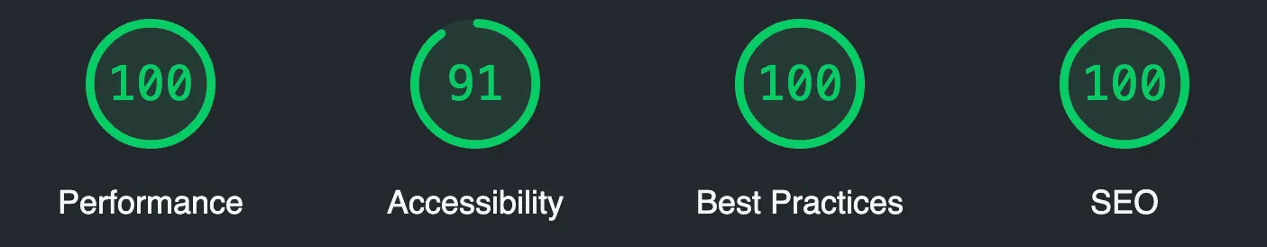
Finally, we can confirm that our Lighthouse scores are solid. Accessibility suffers a bit due to the default syntax highlighter theme lacking contrast for the comments but that’s a problem for another time.
Wrapping up
You’ve made it to the end of this post, dear reader. Hopefully you didn’t just scroll to the bottom, did you? If you did, prepare to be RickRolled in 3…2…1
Subscribe to the RSS feed to keep up to date with my ramblings.